CSS-Think inside the box.
In CSS, everything you see on a webpage is a box and understanding the CSS Box Model is important.

Hello and welcome! Today, we're going to look into one of the most fundamental topics in the CSS-box model.
Now, you might be thinking, "A box? That sounds simple, right?” But trust me I thought the same, but it weirded me out at first. But, Once to get to understand it, everything in CSS starts to make sense, and you'll find yourself thanking the box model as I did😉
Let’s get started 🚀😄
Let’s go step by step and get an overview of each part of the box model from the inside out!
The Fab Four Components:
1. Content - Inside our box, we have the "content." This can be anything: a cute image, a paragraph, a logo, a video, it can be any kind of element. It's what you want to showcase on your webpage.
2. Padding- The next one is “padding”. It is the space between the content and the box's border. Like an extra space surrounding the content. Padding is used to make the visual appearance good and avoid looking at the content packed.
3. Border: The third one is the "Border" which is the visible outline that surrounds the content and padding of the box. It's like a frame that provides shape to the box. The border can have different styles, colors, and thicknesses accordingly.
4. Margin: The outermost layer is the "Margin". It is the space outside the box, surrounding the content, padding, and border. It acts like a protective field to create distance and to help separate from neighboring elements, preventing them to overlap. By using margins, web designers can control how much space is around each element on the page, making sure everything looks neat and organized.
Some silly image I created to illustrate each component:

Content - The Precious Cool Rabbit
Padding - The Clouds and Stars
Border - The Grey Frame
Margin - The Dashed lines
Box Model into Action:
Now that we got an idea of the components Let’s see how it works in real code.
.box {
      /* Content */
      width: 200px;
      height: 100px;

      /* Padding */
      padding: 20px;

      /* Border */
      border: 2px solid #ff6347; /* Orange border */

      /* Margin */
      margin: 30px;
    }
<body>
  <div class="box">I am just a Box.</div>
</body>
This is how the box element looks with properties applied to each component of the box model.
Exploring the Box Model with Developer Tools
So, every element used to create a webpage can utilize various properties for its box model components, and that's what brings organization and consistency to the webpage's layout.
For each element present on the webpage, we can visualize its box model. When you right-click on an element and click 'Inspect' in your web browser's developer tools, you'll find a section called 'Computed' that reveals the box model properties.
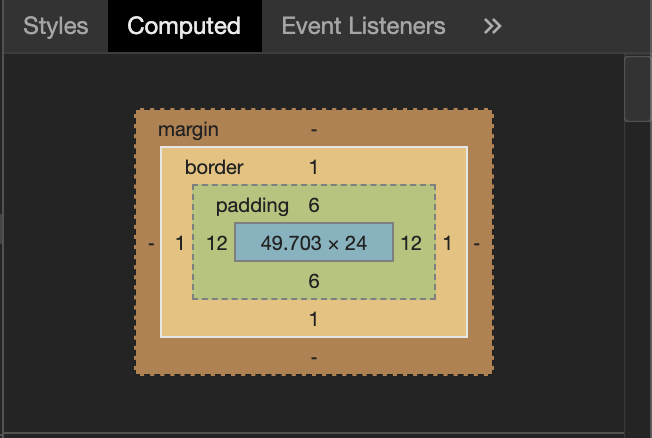
In this 'Computed' section, you can see the exact values for the content, padding, border, and margin of the selected element. These properties work together to determine the element's size, spacing, and overall appearance on the page.
Useful Properties
Some properties we can use for the components of the box model:
1. Content:
background-color- To set a background color for the content.color- To set a text color.text-align- To align the content text in the center, left, and right.font-size- To try different font sizes for your content.
2. Padding:
padding- To apply equal padding to all sides of the content.padding-top,padding-right,padding-bottom,padding-left- To apply individual padding for each side.
3. Border:
border- To add a border of any color and style around the content.border-width- Control the thickness of the border.border-radius- Create rounded corners for your element.border: 2px solid #007bff;- To specify border width, style, and color.
4. Margin:
margin- To create spacing to the sides of the element.margin-top,margin-right,margin-bottom,margin-left- To set individual margins for each side.margin: 0 auto;- Center the element horizontally using auto margins.
Thank you for your time. Let's keep learning! 😸


